Showing posts with label UX design. Show all posts

Computational Culture, a software studies' journal

Computational Culture is an online open-access peer-reviewed journal of interdisciplinary enquiry into the nature of cultural computational objects, practices, processes and structures.

I enjoyed brushing up on my production skills in HTML / CSS and XML, while designing and producing this on-line journal in Wordpress. It is an exciting aspect of social media publishing platforms to open publication opportunities in more flexible, yet easy accessible and distributable ways then traditional media, while addressing institutional requirements for publication.

VW America - DCC (Dealer Communication Center)

VW DCC was an exciting opportunity to put highly intuitive inter-action principles such as fluidity and exploration into action. Users can find VW dealers via drag, zoom, and point and click on a Google map overlay. More traditional lexical navigation options, such as entering dealers' names or zip codes in a search box, and an alternative list view are also offered.

Besides dealing with the business requirements, functional interface and interaction design, I enjoyed acting as a link between strategy, statistics, usability testing and UX, while adding my qualitative research skills. For example I analysed a medium scale database of qualitative user feedback using NVivo, a qualitative research tool. This allowed me to process a large amount of material in just a couple of days. The resulting easy to grasp graphs were offset with quantitative data from analytics software – allowing the team to gain a very high degree of insight into user behaviour. The user centric processes and team efforts paid off, when the site was tested by an independent automotive body :

BERLIN/LONDON - On Tuesday 2 August JDPower released its latest Automotive website survey results. The site launched by AKQA in the US last year increased its overall score by 57 points, bringing the site to a #13 ranking. This is an improvement in ranking of 19 places from our previous JDPower study and set a 5 year record [for VW].

AKQA provided a fast paced and constructive environment (agile), so solutions could quickly be evaluated and optimised. Since this application lends itself perfectly to mobile use, we designed it so all crucial aspects of the navigation are kept in the 10" (iPad) screen area, while also working closely with the mobile team.

On a personal level I enjoyed being on a bi-lingual account, and having a German chat once in a while to brush up on the latest German net-jargon :)

YouView - aka Project Canvas


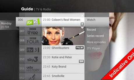
YouView, or Project Canvas, as it was called when I worked on it, is an exciting IP TV venture. Blurring the boundaries between interactive TV, Video-on demand, and Broadband Web-application services, this set up box will be distributed in 2011.

YouView is not a set-top box, per se, but an approach to unifying set-top boxes, much in the same way that TiVo has unified the interface for a variety of set-top box providers that it works with in various markets. The BBC-led subscription free digital TV service, will comprise seven days worth of catchup TV similar to the BBC's existing BBC iPlayer service, as well as a website offering free TV on demand, apps and widgets. TV providers signed up to take part include the BBC, ITV, Channel 4 and Five.

Activity theory, Personas & Agile at PLC

A large part of my work for PLC (Practical Law Company, a legal publishing house) consisted in exploring, researching and documenting how a very specific user group (i.e. lawyers) interacts with internet based products.

In this process I complemented a few standard research methods, such as demographic personas, with a more activity based approach, which also contained high level flow charts. These high level user descriptions in turn can support a variety of scenario descriptions, user requirement documents, and also help to integrate UCD methods in the context of agile development.

PLC covers a number of  different law disciplines, such as financial, tax, commercial, property, aimed at different supporting lawyers as well as senior staff and partners. The user group of “laywers” is, therefore, a very wide matrix. As part of this work, it was crucial to understand that lawyers working in different fields work in very different ways. PLC produces digests from the latest legal publications, helping busy lawyers update themselves on the latest situations with speed and ease.

This sounds like a functional, rational, highly structured field, where functionality is key. In fact, this was very affective-specific work – lawyers are a highly individual user group. They have to get their facts right, or they can be sued (both privately and as a firm). Winning a case depends on them having the correct up-to-date knowledge.

Having confidence in a digest, such as those produced by the PLC, means an enormous amount of trust and previous research: lawyers double-check PLC’s publications to ensure that they are trustworthy.

Imagine a lawyer going about his work: jumping into a cab, reading PLC information on a Blackberry, and then heading straight into a court-room. We named this key emotional branding moment: the PLC moment. This is the moment when a lawyer trusts the publication material implicitly. This ties in with my research thesis that structural, functional and unstructured, emotional interaction are highly intertwined – and this has never been truer than at PLC.

Position
: Senior UXA
Year: 2009 / 2010

Flow charts & documentation


I actually perceive myself as an interface between departments and business sections, so to say. This point of view is reflected in my documentation. Consequently, for example, flow charts that aim at the business or clients might look quite different from more functional high level documentation that helps to facilitate discussions with the technical team.

It's not funny - TVL micro site with social media integration


Concept: Students didn't take TV Licensing seriously – they thought they won’t get caught. As part of the ongoing ‘it’s not funny’ campaign, this site sought to encourage students to compete for the title of the unfunniest uni, replacing the norm of evasion on the campus with TV Licence ownership.
This campaign in particular was supposed to:
  • Extend the TV and print based campaign on the internet
  • Introduce UCD element (Students send their own clips filmed on digi-cam or mobile phone.)
  • Also supposed to send clips directly from phone after taking it and texting jokes in, etc (convergent media approach)
Award: This campaign won the top prize at the 2007 Institute of Direct Marketing awards. The programme was judged to have made “the most outstanding strategic contribution to overall business success in 2007”. This is in addition to the campaign winning the top honours at the Marketing Communications Consultants Association (MCCA) Awards and also being voted Best Integrated Communications Campaign for its “superb combination of creativity, media and outstanding results”. Source (page 4)


Year: 2006
Role: Senior UXA
Agency: Proximity

NEC 343i, IMode phone on O2


This small project for O2 required  re-architecting a few pages form the O2 corporate website for the NEC 343i as a showcase how a convergent solution could work for this site.

(BTW I fell in love with this little phone and bought one for £40 as a back-up phone. It's still ok for email and some basic web interaction (Google maps), and I love the fast access via keypad commands.)

Screen shot O2 corporate website 'Board of Directors'.


Screen shot wireframe example mobile website 'Board of Directors'.


Agency: Rufus Leonard
Client: O2
Year: 2006

Nokia Intranet news hub 2.0


Since this project deals with an Intranet documentation it is confidential, and I can't publish my documentation. Nokia however permitted publication of the screenshot beneath, as it won a usability award in its category. This intranet was one of the first web 2.0 application I designed. It featured cutting edge interaction functionality such as personalisable screen for the users with AJAX modules (i.e. iGoogle style), and highly dynamic linking feature for team members, as well as Flickr integration.

This project won the 2007 Communicators in Business (CiB) for intranet navigation/usability (class winner).

Tasks: Consulting (including running a requirements workshop on-site in Finland), and documentation (IA, Wireframes, etc)

Graphic design: Eddie Finch-Hawkes : Senior Designer

Agency: Red-House Lane
Year: 2006

Orange portal revamp, example 'Film' section in 'entertainment'

I have worked several times for Orange on Wap, Web and convergent projects.

Brief:
This project brief covered several aspects: on the one hand the brand is actively involved in large scale entertainment events, sponsoring movies, film festivals and music concerts. On the other hand, the Orange portal runs an a CMS, that gives limited support for rich media solutions. The brief was to revamp the portal so it would represent the Orange brand more contemporary, stylish and closer to the off-line brand, while still minimising download times, which are forever too long for an impatient entertainment oriented audience. In addition, social media elements, such as with ratings, user reviews, comments and videos, needed to be integrated.

Answering the brief:
This was achieved by implementing 3rd party software (blog software) which had to comply to the same brand guidelines. At the same time this was a convergent solution, e.g. it runs on the mobile UMTS internet, so attention had to be paid that all elements could easily be re-architected for a mobile browser agent and much smaller screens. Also provision was made for mobile video clip uploads a la ‘YouTube’.

My impact
My role as user-experience consultant was to translate the brand guidelines into a design concept that would work for the CMS system. In this function I liased between CMS and web development, 3rd Party envelopers, and graphic design. To keep the page weight down we opted for a Flash solution for larger rich media panels. All flat colours, backgrounds and headers type faces are coded in CSS. To distinguish user generated content from Orange content I developed a subtle visual sub-language for the UGC components, which complied with Orange secondary brand colours. Also a consistent mark-up for all link structure was developed, as well as help and attention elements. I always found that a consistent mark-up and interface elements guidelines have great similarities with consistent brand guidelines, therefore that translation seem natural to me.

Accessibility and legibility
I also pay attention to aspects like on-screen legibility, and micro-typography in on-screen scenarios (e.g. bold type faces’ the tracking needs to run wider). Image manipulation includes settings the best compromise between compression modes and image quality. I also consider general accessibility standards to DDA 2 level (in particular when it came to the flash modules), compliance for screen readers, and other alternative web consumption modes while keeping the brand experience consistent (All ‘alt’ descriptions, etc, are still coded to appear visually ‘on brand’). The complete scope covered about 40 new templates.

Old CMS template and component style:


Design execution Orange in-house design team


Client: Orange
Year: 2006/7

Innovation centre project: Mobile shopping assistant

Rubus Innovation Centre project:

Concept: Develop ideas and strategies for M asp applications > shopping agent to be trialled at the Bluewater shopping centre. This solution connects local BLuetooth connectivity (e.g. offers from local shops) with general Internet connectivity (check and compare competitors offers, or order or pay via the phone).

Challenge: Use of latest mobile technology research (Bluetooth, sms,Wap), develop convincing strategy for a product with few existing market references.

Tasks: Market and technology research, expert consulting, brainstorm sessions, concept development, storyboard development, design brief for execution, testing and service development.

Agency: Rubus

Role: Creative Digital Consultant

Year: 2000

Wap @ IAA 2000, NWSS- Nokia Wireless services

Promotional campaign for London's fair for international advertisers 


Challenge: Introduce Wap service to a "print oriented" audience. Introduce Nokias 7110 As Wap device (also test 'Navi roller') Convince advertisers of Wap as a valid advertising medium. Position WAP as time sensitive dynamic advertising medium.

Solution: Extensive user testing of 7110, integration of findings in interface/gui solution Consistent use of Graphic elements (Banners, structural graphics, section header graphics). Reliable data performance was achieved by working with a mobile base station, present on-site.

Tasks: Requirements collection, client consulting, concept development, interface development, information architecture, documentation, on site user liasion, testing, phone set up
Agency: Satama

Role: Conceptual design lead
Year: 2000

B-2-B E-commerce site, NOLS (Nokia on-line services)


Phase I: Development of e-commerce pilot, b-to-b, online order for Network backend solutions, support, software downloads. 


Challenge: Nokia Nols' first Extranet/E-commerce experience.
multiple backend system integration (Vignette/DB2/Lotus domino/IBM WebSphere)


Phase II: Addition of email notification for partners, communication platform for partners (i.e. IBM) internal approval process, order tracking, extended product catalogue, prepare intranet input templates for WAP access. 

Tasks: Requirements collection, client consulting, concept and interface development, paper prototyping, info architecture, documentation (business preposition, user experience journey, use cases, site architecture, uml diagrams), creative & developer brief, liasing with tech/back end designer & 3rd party integrater (IBM).

Agency: Satama
Role: Conceptual design lead
Year: 2000

X-press-on covers, Nokia campaign website


X-press-on covers,
A short term promotional site, idea: vote for the best xpress-on cover, runs parallel with retailers campaign.

Challenge: establish a very playful approach within a big coorporate with strict guidelines.

Solution:
Re-use of circular display for phone covers as "wheel of fortune", which can be spun and nugged, to choose favourite cover. (Flash)
The dynamic voting form is pre- filled in based on choice in the wheel; dynamic chart build up, again, based on choice of x-press on cover in wheel.

Tasks: Requirements collection, client consulting, concept development, interface development and paper/director prototyping, information architecture, documentation, creative brief, developer brief, liasing with 3rd party integrater (external WebDev company).


Agency: Satama

Role: Conceptual design lead

Year: 1999

COI - National Blood Service

The National Blood Service campaign traditionally has a strong
emotional element to it to convince people of the importance
to donate blood. The challenges at the time (1997) was
to provide rich emotive imagery on a technically restricted platform,
e.g. data transfer on a dial-up modem and HTML 3.0.
Therefore the web imagery was kept in Black and White imagery
with red accents in the typography.
Agency: PoppeTyson (later ModemMedia)
Role: Creative Project Manager
Year: 1998

Nokia Cebit 2000

Development of 3G world, long-term campaign site about 3rd Generation solutions and visions.

Challenge: Build up a 3g vision for consumers, technical experts and media without creating realistic expectations.

Solution: Interactive flash demos for endusers Insider Info for technical audience Dynamic press release section for media Glossary covering novice and medium knowledge level

Client: Nokia, Business division NMP: (Nokia Mobile Phones)

Consultancy: Satama, Helsinki

Tasks: Requirements collection, client consulting, concept development, interface development and paper/director prototyping, information architecture, documentation, creative brief, developer brief, liaising with 3rd party integrater (external WebDev company), back-end technology: Vignette Storyserver

Awards: This site was awarded as 'best 3G introduction site' at the Cebit 2000

Year: 1999